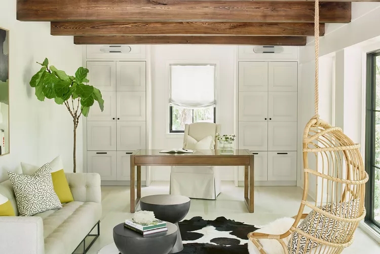
Use the stained desk and beams to play off of one another for visual balance. The built-ins along the back wall flank the window to create three equal parts. Photo by Marc Mauldin / Courtesy Elle Du Monde
Design pros share tips and examples for this trick that helps you create balanced spaces.
Arranging furniture, decorating a room, and styling a bookshelf require finding a configuration that feels right. But as you work out the layout, identifying what makes the space look off can be a challenge. The rule of thirds is one technique you can use to help you find that perfect balance when decorating your home.
What Is the Rule of Thirds?
“The rule of thirds is a design tool used to create balance in a room with furniture and decor by examining a space through a symmetrical grid,” says designer Lindye Gallow of Lindye Galloway Studio. “The grid guides spacing and proportions through dividing up the composition horizontally and vertically into left, right, and center parts to help you create visual harmony in your space,” Galloway adds.
The rule of thirds is not a strict rule so much as it is a way to help you lay out a space or evaluate an arrangement. “You want to create visual balance without the space feeling forced or too symmetrical. This technique allows an easy way to make sure the room is weighted properly,” says designer Elle Cantrell of Elle Du Monde.
How to Use the Rule of Thirds
To use the rule of thirds, think of dividing the space you’re arranging into a grid with three columns and three rows, or nine boxes. This allows you to view the room in thirds, so you can compare balance between upper, middle, and lower thirds, as well as between left, right, and center.
“While typically used to map out the composition of a room, the grid can also be applied to smaller spaces in the home where decor is displayed, such as fireplace mantels, built-ins, or shelves,” says Galloway.
Cantrell says comparing areas of the grid “allows you to check the balance of the space and overall composition,” whether you’re laying out an entryway or a home office. As you mentally impose the grid over the space, “look at how colors, textures, and values compare in each square,” Cantrell advises. “The shapes and forms in each square can vary as long as the grid appears balanced in visual weight.”
Tips for Using the Rule of Thirds
As you begin learning the rule of thirds, Galloway says to start small.
“Test out the rule by placing decor on surfaces such as coffee tables or bookshelves to play around with their arrangement. That way, you can practice creating balance before working up to arranging larger items that make a bigger impact in your space, such as artwork or furniture.” Cantrell adds that you can try the rule of thirds when determining the number of pillows on a section or dressing a bed.
“Odd numbers tend to be more pleasing to the eye,” says Cantrell, whether you’re evaluating one-third or comparing the overall grid. The rule of thirds may be confused with the rule of three, but they’re different. The rule of three refers to the effectiveness of grouping three items together, from furniture to decorative accents. The rule of three may be applied while designing a space using the rule of thirds. “While you’ll want to make sure you’re grouping your objects together in sets of three, feel free to experiment with a variety of decor with different shapes, textures, and heights to maintain balance while also bringing visual interest to your space,” adds Galloway.
“Don’t discount your floors!” says Galloway. Properly positioning rugs can make a big difference when creating balance through the rule of thirds. “For example, if the coffee table is arranged central to the space, you’ll want to place a rug directly underneath and arrange additional furniture around the area to maintain symmetry. If opting for a smaller rug, make sure the rug covers one-third of the area to allow for the other elements in the room to stand out.”
Kristina McGuirk, Better Homes & Gardens

