For some, it’s pumpkin spice season. For those in the design world, it’s Color of the Year season, when paint companies and aesthetic authorities release their picks for the hues that will be influential and impactful in the year to come. In years past, we’ve seen bright, punchy peaches, terra cottas, and teals, but this year so far has a richer, earthier quality to it. Read on for the shades that have been announced so far, and check back often for updates.

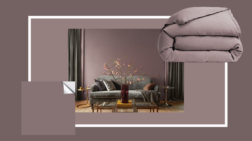
Benjamin Moore Color of the Year 2025: Cinnamon Slate
About the color: Part plum, part brown, this nearly perfect mauve is subtle but powerful. It’s soft enough to work in just about any space without screaming “Purple!” but deep enough that it’s uber-chic. I can see this color enduring, always feeling new but also like it’s always been there.
Paint with it: Cinnamon Slate is begging to go on a wood fireplace surround, on interior doors, and any and all molding. The tint is almost velvety and would be stunning in a flat or eggshell finish.
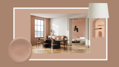
Dunn-Edwards Color of the Year 2025: Caramelized
About the color: Brown is one of the most popular neutrals of the moment, but for anyone who can’t quite lean into the deep earth tone, Caramelized might be just right. It’s a warm terracotta that reads peachy for a sunbaked look. It’s versatile but pigmented enough to still make a statement.
Paint with it: The tawny brown is ideal for a home exterior finished in stucco or plaster, as the imperfect natural materials give the paint movement and variation. Caramelized would also look great in any interior space where you already have other warm neutrals and light oak or maple wood furniture.
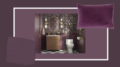
Glidden Color of the Year 2025: Purple Basil
About the color: Purple Basil is one of three in this color family for 2025, but while Benjamin Moore’s COTY leans brown and earthy, and Minwax’s Violet is punchy and playful, Glidden took a richer yet still saturated approach. It’s unapologetic, maximalist and daring.
Paint with it: Depending on your house style (for instance, if you live in an old Craftsman or a Victorian), Purple Basil would be killer on window trim or any other trim accent on your exterior. And since that won’t work for everyone, try it in a power bath paired with a complementary wallpaper.
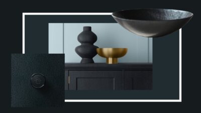
Krylon Color of the Year: Hammered Black
About the color: As much a texture as it is a color, Hammered Black adds a modern edge to anything you take the can to while also feeling storied and stately.
Paint with it: This hammered finish in a stately black is incredibly versatile. I’d take it to any vase or plant pot you want to give a fresh update to, a small side table, a 1980s-era shiny brass chandelier or a mirror that could use new life.
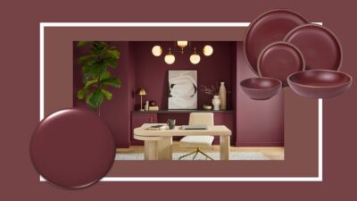
Behr Color of the Year 2025: Rumors
About the color: Rumors is a deep ruby red, a moodier answer to one of 2024’s biggest color trends: unexpected (bright) red. Its undertones have enough blue to feel saturated but not shocking, and can transform depending on the sheen you pick.
Paint with it: A color this rich and romantic begs to cover the walls of a cozy TV room, elegant bathroom or office (as long as you have good natural light!).
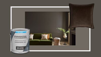
Stainmaster Color of the Year 2025: Truffle
About the color: Not quite gray, not quite brown, Truffle is a good, modern stop in between. It would look glorious with warm jewel tones (think olive green or citrine velvet) or lots of creams, beiges, and oatmeals in natural textures like linen.
Paint with it: If you’ve considered color drenching, Truffle in a flat or satin finish would be incredibly chic, enveloping, and warm in a bedroom suite, media room or even a mudroom.
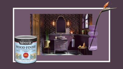
Minwax Color of the Year 2025: Violet
About the color: A shade of purple is always a bit of a wild card pick since it’s not a common color in most people’s home-hue Rolodex. But since Minwax is not meant for walls (it’s a wood stain), there’s more room to play. Violet is whimsical, spirited, and a little Victorian.
Paint with it: If you’re after something unexpected and playful, try Violet on a wood bathroom vanity or window trim. It would also be great on any kid furniture.
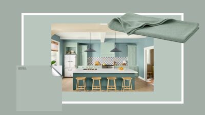
HGTV Home by Sherwin-Williams Color of the Year 2025: Quietude
About the color: Quietude feels like a safe bet for HGTV Home by Sherwin-Williams, but that doesn’t make it any less of a classic. It’s a beautiful sea glass hue with some gray in it to make it milky and pleasing on large-scale furniture or any wall in basically any room of the house.
Paint with it: This pleasant green with blue undertones has enough depth to be used on the exterior of your home (it would be great on a Colonial or even Craftsman bungalow with a deep red accent trim). If your exteriors are all set, try it on the walls of a kitchen with deep green cabinets.

Valspar Color of the Year 2025: Encore
About the color: For 2025, Valspar is betting on Encore, a fully saturated cobalt blue. We saw some bold blues pop up in Delft and Chinoiserie this past year, and if this color is any indication, the happy hue is ready to leap off small-scale decor and onto your walls and casegoods.
Paint with it: Encore is a bright, clear blue that benefits from lots of sunlight to really shine. Should you have an alcove or room with floor-to-ceiling built-ins, you won’t regret bringing this moment into your home.
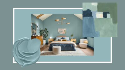
Dutch Boy Paints Color of the Year 2025: Mapped Blue
About the color: Similar to Quietude but with a bit more blue, Mapped Blue by Dutch Boy Paints is another easy-going COTY that works in a multitude of settings and applications. It’s calming, soft and a solid color for anyone wanting to dip their toes in the non-neutral pool of design.
Paint with it: Mapped Blue might just have gotten its name from the fact that it can “cover the map” of places to use it. It would make a great kitchen cabinet or bathroom vanity shade, but would be happy on the walls (and ceilings and moldings) of any living room or sleep space.
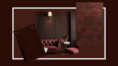
C2 Color of the Year 2025: Raku #549
About the color: C2 and Stainmaster are on similar wavelengths for 2025 in the brown family, but unlike Truffle, Raku has a burnt brick red quality that looks almost like earthenware. Applied in a matte finish, it begs you to run your hands along it. Pair it with deep burgundies to bring out its red or sumptuous chocolate browns and black for a monochrome contemporary vibe.
Paint with it: A color like Raku craves filling the nooks and crannies of trimwork, so try it in any room with lots of woodwork, picture frame molding or the like.
Arlyn Hernandez, realtor.com

