

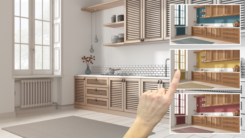
A cohesive kitchen color scheme depends on relationships. The cabinet color may be beautiful, but does it flatter the countertop? The backsplash may be exquisite, but does it fight the flooring? The wall color may look perfect on a paint card, but does it make the cabinets look too yellow, too blue, or too flat?
This is where kitchens become more complicated than other rooms. Living rooms can absorb decorative shifts through upholstery, rugs, art, and accessories. Kitchens are less forgiving because so many surfaces are fixed, reflective, or patterned.
The elements that most commonly affect color relationships are:
-
- Countertops and backsplash materials
- Flooring and wood tones
- Metal finishes and hardware
- Natural versus artificial lighting
Understanding Undertones
Undertones are the reason some kitchens feel harmonious while others never quite gel. A white may be warm, cool, chalky, creamy, grayed, or slightly pink – depending on whether its undertones lean toward warm colors vs cool. A beige may lean yellow, red, or green. Stone, wood, tile, and metal all carry undertones too, which is why seemingly subtle differences can completely change how a palette reads.
‘My best advice for identifying undertones, especially in kitchens, is to pull a few similar colors and compare them,’ says Michelle Lisac, founder of Michelle Lisac Interior Design. ‘For greens I tend to lean towards cooler, more blue undertones rather than warmer yellow undertones.’ That side-by-side comparison is often the quickest way to spot when something feels slightly off.
A warm cream cabinet may look elegant beside limestone and oak, but strangely flat next to a cool gray quartz. Carrara marble often wants cooler companions, while travertine usually sits more comfortably with warmer whites, mushroom tones, and aged brass. That said, not every element needs to be either fully warm or fully cool. Some of the most beautiful kitchens deliberately mix the two – cool marble can look fantastic against warm oak because the contrast feels clear and purposeful.
Problems usually happen when undertones are almost aligned, but not quite. ‘When assessing undertones across the array of finishes in a space, I try to ensure a good balance of cool and warm tones,’ adds Michelle. ‘I especially like to mix the metal finishes, but strategically. For example, I love a bronze or matte black with an unlacquered brass.’
Choose Tonal, Contrast, or Complementary Colors
Once you’ve got your undertones under control, it helps to decide what kind of color relationship you want. Tonal kitchens use variations of the same family: cream cabinetry, taupe walls, limestone counters, and oak floors, for example. ‘If the kitchen is open-plan and bleeds into a living or dining space, tonal almost always reads better – contrast can start to feel choppy when it’s competing with other rooms,’ says Victoria Forehan, founder of Victoria Forehan Design.
Contrasting kitchens use differences to create definition. White perimeter cabinets with a charcoal island, pale stone against dark cabinetry, or black hardware on warm oak all give the eye somewhere to land. This approach works well in larger kitchens and rooms with strong architectural features.
Complementary schemes are more decorative. They bring together colors that enhance each other, such as dusty blue cabinets with copper accents or muted green kitchen cabinetry with warm terracotta flooring. These combinations can be beautiful, but they need softening. In kitchens, fully saturated complementary colors can quickly feel too loud, so muted, chalky, or earthy versions tend to be more successful.
Let Materials Do Some of the Color Work
Paint is only one part of the palette. Wood grain, stone veining, tile texture, metal finish, and even upholstery all contribute color, which is why the most sophisticated kitchens rely less on painted surfaces than you might expect. A beautifully balanced scheme usually comes from the relationship between materials rather than a single standout paint shade.
‘When pulling together finishes for a project, we always lay the materials out on our large white conference table,’ says Michelle Lisac. ‘This helps to see the pieces as a whole, and we switch out finishes until the balance feels right.’ A useful rule is to let one material lead. If the stone is heavily veined, the cabinetry may need to be subtler. If the backsplash is handmade and tonal, a simple cabinet color may already be enough. ‘The countertop stone is a major factor to consider,’ she says. ‘You can complement the stone’s colors by accenting with the paint color(s) or let the stone be the star of the kitchen by pairing it with wood cabinetry.’
The same balanced approach applies to timber tones. Beautiful oak cabinets may need a calmer countertop, while a richly colored island often sits more comfortably when the perimeter is pared back. ‘Regarding wood, I always steer away from red or yellow tones and try to find that nice neutral tone that complements almost everything,’ adds Michelle.
Test Colors Vertically, Not Flat
Paint and cabinet samples should be tested vertically because that is how they will be seen in the finished kitchen. A color lying flat on a table receives light differently from a cabinet door or wall.
Place samples next to the actual countertop, backsplash, flooring, and hardware whenever possible. Look at them in morning light, afternoon light, and after dark. If the kitchen uses under-cabinet lighting, pendants, or recessed ceiling lights, switch those on too. A color that is beautiful in daylight can shift dramatically under artificial light.
This is especially important with white, gray, green, and blue, which are all highly reactive to light. What looks soft and elegant in a showroom can feel cold, muddy, or unexpectedly bright once you get it home.
‘Lighting has such a significant impact on how a kitchen color palette reads and feels throughout the day. We always consider the room’s natural light, orientation, and LED temperatures before finalizing finishes,’ agrees Christine Markatos. ‘In this kitchen, the layered whites and soft neutrals shift beautifully with the daylight, while the warm brass and wood accents keep the space feeling inviting rather than flat.’
Popular Kitchen Colors Schemes
The best kitchen color ideas balance inspiration with longevity, and they work because they are flexible, adaptable, and rooted in materials that age well. Nobody want a dull kitchen, but it does need to outlast a short-lived color trend cycle. The palette directions designers return to repeatedly include:
Neutral and Timeless
Neutral kitchens work because they leave room for texture and materiality to bring the interest and personality. Warm whites, greige, cream, oak, marble, and aged brass create depth through subtle tonal shifts rather than obvious color. The best neutral kitchens never feel flat, they rely on grain, veining, and finish variation to add interest.
Best for: long-term renovations, smaller kitchens, and anyone wanting calm without coldness.
Warm
Warm color schemes feel softer and more welcoming than the cool gray kitchens of the past decade. Cream, taupe, terracotta, olive, and walnut all bring richness without overwhelming the room. These shades pair beautifully with natural materials like travertine, bronze, and dark wood. Grounding elements like muted greens, blackened metals, or honed stone keep the palette sophisticated.
Best for: family kitchens, period homes, and spaces with good natural light.
Cool and Calming
Calming kitchen color schemes, like light blue kitchens, sage greens, and blue-gray tones, can make a kitchen feel calm, ordered, and elegant. The trick is preventing cool palettes from feeling clinical. Natural textures – oak floors, woven seating, antique brass, or plaster finishes – soften the sharper edges and add warmth back into the room. Muted, muddied versions of color tend to feel more timeless than highly saturated shades.
Best for: coastal homes, south-facing kitchens, and anyone craving a serene atmosphere.
Dark
Dark kitchens feel dramatic because they create contrast and depth instantly. Navy, deep green, charcoal, chocolate brown, and black all work best when layered with lighter stone, warm timber, or reflective metals to stop the space from feeling heavy. Statement color does not have to dominate the entire room either – islands, larder cabinets, or lower cabinetry can often deliver enough impact on their own.
Best for: large kitchens (or small, cozy ones), and those wanting something moodier and more architectural.
Linda Clayton, Homes & Gardens