

From lighting to layout, this expert-led guide will help you choose kitchen colors that work beautifully together.
Choosing a kitchen color scheme should be one of the most exciting parts of planning a kitchen. In reality, it can feel overwhelming, particularly when mistakes can prove expensive. A wall color can be repainted in a weekend, but cabinets, countertops, backsplash tiles, flooring, and appliances are far harder to switch out.
The difficulty is that kitchens are built from permanent materials that all need to work together. Cabinet colors have to flatter countertops, backsplashes need to connect with flooring, and even the light can completely change how a color behaves from one room to the next.
This is why the strongest kitchen color ideas rarely begin with paint charts. More often, they are shaped by the architecture of the house, the atmosphere you want to create, or a standout material that sets the tone for everything else. ‘Before we look at a single paint chip, we look at the ‘soul’ of the home. We lean into its history and the client’s own story,’ explains Alissa Pulcrano, founder and principal designer, Bright Designlab. ‘This leads us toward the color palette naturally – whether it’s moody, romantic pastels, wood ceilings with marble islands, or bold jewel tones with striking patterns on a concrete tile floor.’
The easiest way to reduce the pressure is to stop thinking about one perfect color and start thinking in terms of a connected palette. A successful kitchen color scheme is not a single shade; it is a system of materials, tones, finishes, and contrasts that work together. Whether you are planning a full remodel, repainting cabinets, or simply trying to make existing finishes feel more you, this comprehensive guide explains how to create a kitchen color scheme that feels cohesive, practical, and timeless.
The Five Step Framework For Kitchen Color Success
The best kitchen color schemes are rarely chosen in isolation. Designers tend to build palettes in a specific order, starting with the most permanent materials in the room and layering everything else around them. It turns the process from overwhelming guesswork into something far more logical – a five-step framework that helps every decision feel connected, balanced, and easier to get right.
Start With the Fixed Elements
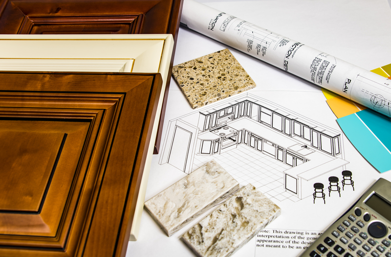
Begin with the parts of the kitchen that are already decided or will be most expensive to change. In a remodel, this usually means countertops, flooring, cabinets, appliances, architectural details, and any finishes that continue into adjoining rooms. In an existing kitchen, it might mean working around a stone counter, wood floor, stainless steel range, or inherited cabinet finish.
These fixed elements will tell you more than you might expect. A marble countertop with blue-gray veining will naturally pull the kitchen in a cooler direction, while a quartzite or limestone with creamy movement may call for warmer whites, taupes, or natural wood. Oak floors can introduce golden undertones; walnut adds richness and depth; terracotta, brick, or aged stone will instantly make a crisp white palette feel more complicated.
As a starting point, focus on the surfaces that carry the most visual weight:
- Countertops and backsplash
- Flooring and adjoining materials
- Appliances, hardware, and architectural details
This is why it is often wise to choose the countertop before the paint color. Stone and engineered surfaces tend to have undertones, pattern, and movement that cannot be ignored. Paint, by comparison, is the easiest element to adjust. If you are still exploring surfaces, looking at kitchen countertop ideas alongside backsplash ideas will help you understand whether you are naturally drawn to cool, crisp combinations or warmer, earthier ones.
A useful shortcut is to pull one or two tones directly from the countertop or tile. If the stone contains a soft taupe vein, that tone might become your cabinet color. If the tile has a chalky, off-white base, that may point you toward the right wall color. This does not mean matching everything exactly, but it does mean allowing the materials to lead.
Choose the Dominant Color
Once the fixed materials have been established, decide which color will dominate the room. In most kitchens, this is the cabinetry because it covers the largest visual area. Even a neutral cabinet color carries enormous weight because it sits at eye level, frames the appliances, and defines the mood of the space.
A dominant color can be subtle or dramatic. ‘When designing a kitchen, we like to start with a dominant color that feels timeless, soft, and reflective of the natural light in the space, then layer in complementary tones for depth and warmth,’ says Christine Markatos Lowe, principal of Christine Markatos Design.
The question is less ‘what color do I like?’ and more ‘what do I want this kitchen to feel like every day?’ For a bright, classic kitchen, the answer may be warm white cabinets, pale stone, and oak. For something calmer and more cocooning, it might be mushroom cabinetry, honed marble, and bronze hardware. If the room is large and filled with natural light, navy, charcoal, or deep olive can give it the structure it needs. In small kitchens, a softer tonal palette will make it feel more generous.
This is where researching the best kitchen cabinet colors can be genuinely helpful. Cabinetry is too expensive and visible to choose purely on passing kitchen trends. The most successful shades tend to have enough complexity to feel designed but enough restraint to live with for years.
Build a Supporting Palette
After the dominant color comes the supporting palette. Beware, there is a fine line between beautifully layered and mildly chaotic. A strong supporting palette includes two or three additional tones, max: one for walls or secondary cabinetry, one for the countertop or backsplash, and one accent finish through hardware, lighting, or furniture.
Some combinations are enduring because they balance warmth, contrast, and texture so naturally. Warm white cabinetry with oak and aged brass feels relaxed but polished. Sage green with marble and antique bronze feels classic without being predictable. Mushroom, travertine, and walnut create a softer, earthier mood, while navy, white quartz, and polished nickel feel more tailored and crisp.
The important thing is that the supporting colors should relate to one another without looking too matchy-matchy. A kitchen where every surface is the same shade of cream can feel flat; a kitchen where every element competes can feel restless. The sweet spot is subtle variation: colors that share warmth, depth, or softness, but bring different textures to the room.
If you are drawn to gentle, layered neutrals, greige kitchen ideas and beige kitchen ideas are useful references because they show how designers build interest without relying on high contrast. These schemes often succeed through texture: honed stone, oak grain, handmade tile, woven seating, or softly brushed metal.
Introduce Contrast with Intention
Contrast gives a kitchen structure. Without it, even a beautiful palette can feel too safe or washed out. It’s crucial to decide exactly where contrast should happen, rather than scattering it randomly across the room. ‘When introducing contrast into a kitchen, we like to take a layered approach that makes the space feel exciting and full of life while still remaining timeless,’ says Christine.
A darker kitchen island color is one of the most reliable ways to introduce that depth because it anchors the center of the room without overwhelming the perimeter. Contrasting lower cabinets can have a similar effect, particularly in kitchens where wall cabinets are kept pale and unobtrusive. Kitchen hardware also plays an important role here – bronze, brass, matte black, or polished nickel can completely shift the mood of cabinetry without requiring a major color commitment.
In larger kitchens, stronger contrast often helps define zones. A walnut island can warm up pale cabinetry; a dark stone backsplash can make a cooking area feel more architectural; black window frames might justify darker accents elsewhere. ‘In this kitchen, we used Stone Blue on the island, which contrasts beautifully with the warm wood tones of the chairs and flooring, alongside muted Yarmouth Blue cabinetry to create depth and dimension while still keeping the space feeling open, airy, and inviting,’ explains Christine.
In smaller kitchens, contrast works best when handled more gently. Too many sharp shifts between dark and light can chop up the room visually and make it feel tighter. That is why the latest two-tone kitchen ideas feel softer and more nuanced – think cream and oak, sage and warm white, mushroom and walnut, or deep blue paired with pale stone.
Layer In Material, Texture, and Lighting
Color never exists alone in a kitchen. It is changed by texture, sheen, light, and the materials around it. A matte cabinet door will make the same color feel softer than a glossy lacquer. Honed stone feels quieter than polished marble. Handmade tile adds shadow and movement. Brushed brass reads warmer and more relaxed than shiny chrome.
This is why a simple palette can still feel rich. A warm white kitchen layered with white oak, marble, zellige tile, linen shades, and aged brass will have far more depth than a room made from flat white surfaces alone. Equally, a dark green kitchen can feel heavy if every finish is smooth and dense, but elegant if balanced with pale stone, warm wood, and well-placed lighting.
Lighting is the final test. North-facing rooms can make whites and grays feel cooler. South-facing kitchens intensify warm tones. East-facing kitchens are brightest in the morning, while west-facing rooms can become golden later in the day. Artificial light also matters: warm LEDs can soften a palette, while cooler lighting can expose blue or gray undertones.
Before finalizing any color scheme, test samples in the actual room at different times of day – the same colors can shift dramatically from bright morning light to evening sundown.
Linda Clayton, Homes & Gardens
Next week: How to Choose Kitchen Colors That Work Together