You have the accessories, the furniture, and the color on the walls. But is something not quite right? One of these common decorating problems may be to blame. But don’t fear — these mistakes are easy to fix.
Mistake #1 – Poor Lighting
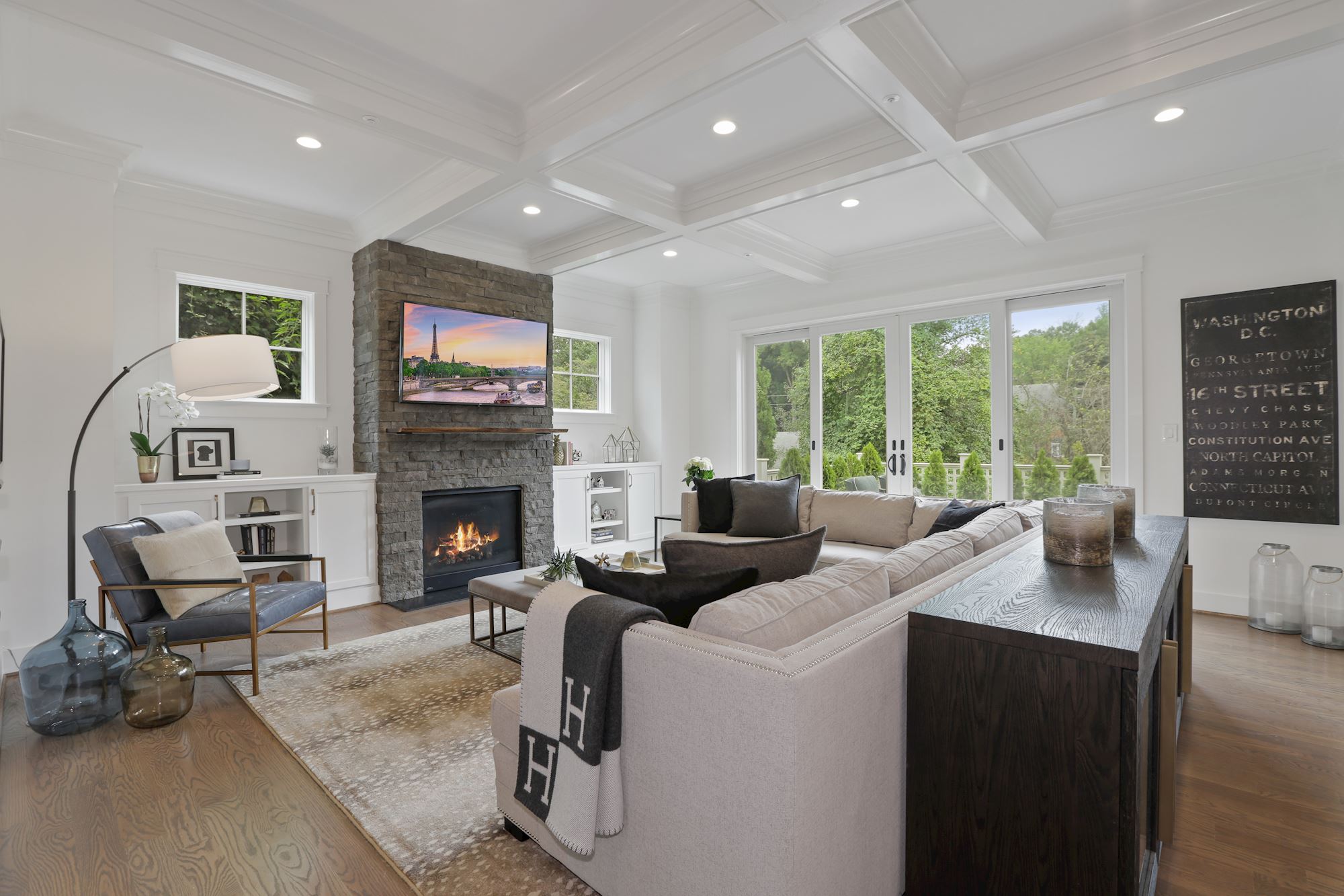
We’ve all had to get over the tendency to light a room with one bright overhead and a big clicky wall switch. The warmest way to light a room is in layers. Make a plan as you would with a furniture layout, with task lighting for work areas, accent lamps to add color and personality, and put that overhead light on a dimmer to change the mood of the room throughout the day.
 Mistake #2 – Tiny Rugs
We know it’s more expensive to buy the big rug. But the postage-stamp look really brings down a room. Luckily, there are great choices out there at a wide variety of price points. In the dining room, measure the width and length of your dining room table and add 18-24 inches to each of the four sides to allow extra room for the chairs (include your table leaf in the calculation). For most spaces, that means a 5×8-foot rug is too small, so look for something between 6×9 and 9×12 feet.
Mistake #3 – Wall-Hugging
Maybe that’s not the official name for lining up every piece of furniture along the wall, but you get the picture. One layout alternative is to find a focal point in the room — entertainment center, fireplace, each other for conversation — and build your design around that. Move furniture away from the walls for a more intimate feel, with chairs no more than eight 8 feet apart to encourage talk. Position a table within reach of every seating piece, with traffic lanes several feet wide to allow easy movement.
Mistake #4 – Cluttered Decor
It’s easy to pack your rooms with way too much stuff, but that look crosses over easily to clutter (and the next step is hoarding, so beware). When every surface is covered with tchotchkes, nothing stands out as special. Solve the issue by clearing off every surface in a room, one by one, and returning only half the things on it. Be your own tough editor and store the objects that didn’t make the cut this time. You can bring them out next season — or make a donation trip to the secondhand store.
Mistake #5 – Too Much of One Color
Whitewash walls in an art gallery serve a purpose: standing down in deference to the colorful beauties on the wall. But our own living spaces deserve a good dose of color variation. Even if it’s just a single deep-blue pillow amid a sea of neutral beige, adding a little pop of your own will spice up any room in a snap.
Mistake #6 – High Art
Few things personalize a space like the things you choose for the walls. But hanging stuff can be tricky. The first step is to figure out the correct hanging height. Hang your art at the average person’s height — roughly 57 inches from the floor — so most eyes can look straight and see it comfortably.
Mistake #7 – Ignoring Scale and Proportion
Does your room feel sort of underwhelming? Or way too crowded? You may have an issue with scale, which means the visual size of things, and how they look in relation to each other and the space. For your pieces to stand out, rooms need big things and little things, tall things and short things. It’ll make things look a lot more interesting.
Mistake #8 – Wrong-size Curtains
Window treatments are readily available at most box stores, so replacing curtains that are too long or too short is a weekend day away. For quick hanging, choose tab-top or grommet styles, which slide easily onto the rod. To find the right panel length, measure from the floor to just above the window casing. Mount the rod to match panel length, rather than the other way around, as you would for custom-made curtains. Panels should be as wide as the window and rod brackets mounted six inches outside the frame so panels can be pushed away from the glass easily.
 Mistake #9 – Fear of Color
Although neutral colors are timeless, a splash of bright or dark color can do wonders for elevating a space’s style. Energize a room by incorporating a bold complementary color into small accents, like throw pillows, artwork, and storage.

