In a fast-paced, increasingly digital world, it can be comforting to surround ourselves with the nostalgia of analog-driven times. Adorning our homes with a vinyl record player in the living room or an antique clock in the kitchen doesn’t only serve as charming decor but also as a reminder to slow down and settle in. That is, in part, the inspiration behind HGTV Home by Sherwin Williams’ 2023 Color Collection of the Year. The Vintage Homestead Collection, which includes 10 complementary paint colors, was curated to embody many of the things you might expect to experience when stepping into an antique store: romanticism, tradition, nostalgia, and comfort.
The collection was also inspired by a growing home decor trend. “There is a newfound appreciation of vintage-inspired color and aesthetic,” Ashley Banbury, senior color designer for HGTV Home by Sherwin-Williams says. “Designers and DIYers are bringing vintage-inspired décor and details into the home as a way to bring a sense of comfort.”
As the variation of the collection shows—ranging from deep purple to a soft, sage-tinted gray—there’s no one way to do vintage decor, and the colors can look as modern or as timeless as your interiors. See our five favorites from this vintage-inspired collection—including the 2023 Color of The Year—below.
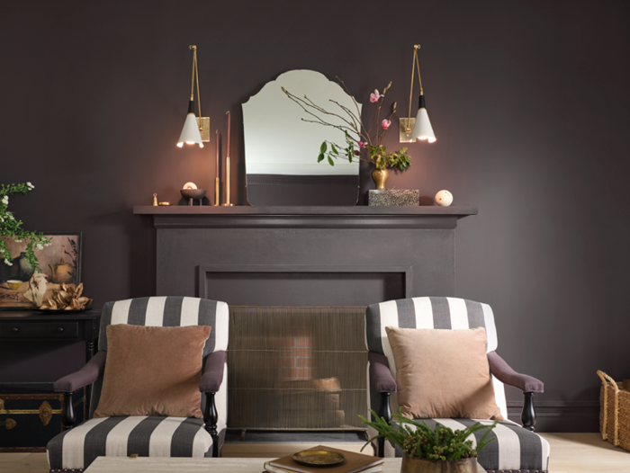
2023 Color of the Year: Darkroom
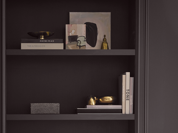
It’s fitting that the star of this vintage-inspired collection is a nod to a highly romanticized but (for the average person) antiquated art form: film photography. Darkroom, the 2023 Color of The Year, is a deep black shade with purple undertones. While the paint shades often touted for versatility are usually on the other end of the color spectrum, Banbury says this dark shade can do it all. Use Darkroom as an all-over wall color to create a “cocooning environment” with a sophisticated feel, she says. Or, for smaller touches, use the shade to create a focal point on a kitchen island or add dimension to your home by painting it on doors and trim.
Hot Cocoa
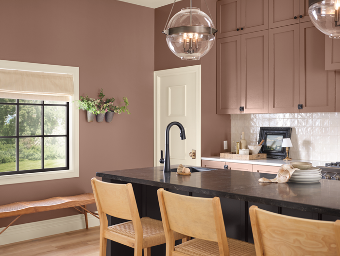
If you’ve been paying attention to fashion trends, you’ve likely noticed that brown has returned as a newly appreciated neutral. Along with this renewal has been the dismantling of old styling rules—like the one that says you can’t pair brown with black. This warm brown shade, Hot Cocoa, is a testament to that, pairing great with the collection’s core color. The paint color is also nicely complemented by natural materials, like linens and wooden furniture.
Restrained Gold
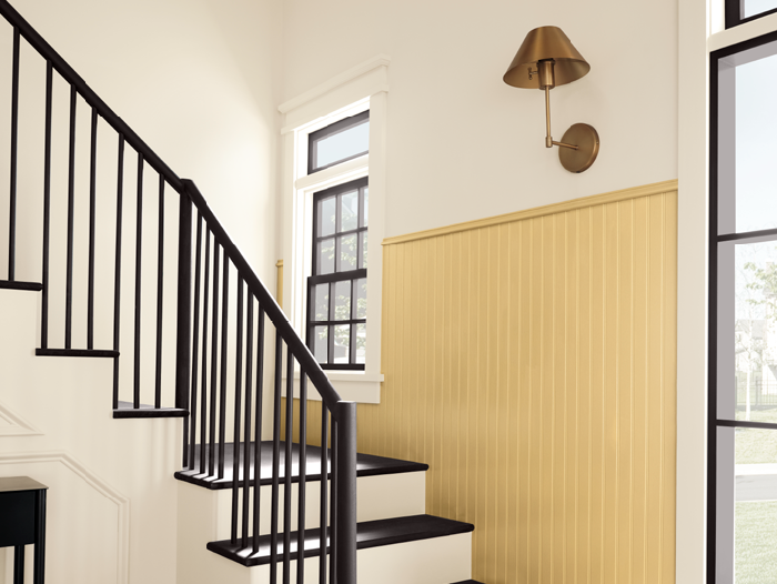
Yellow paint can be intimidating, but this Restrained Gold shade is about as toned-down as the sunny color can get. The warmth of the yellow is great for brightening up a dull room, while the gold tone makes it easy to pair with other neutral colors (like the Natural Linen shade from the collection, which is also pictured above.)
Austere Gray
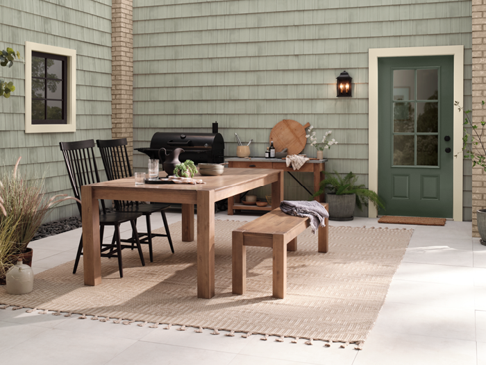
The sage green paint trend is no longer new, but this subtle shade feels like a reinvented approach. Austere Gray is a cool-toned shade with an ever-so-slight tint of light green. If your design style leans more neutral, this shade is a great way to add soft color to your kitchen or exteriors without it feeling overpowering.
Glamour
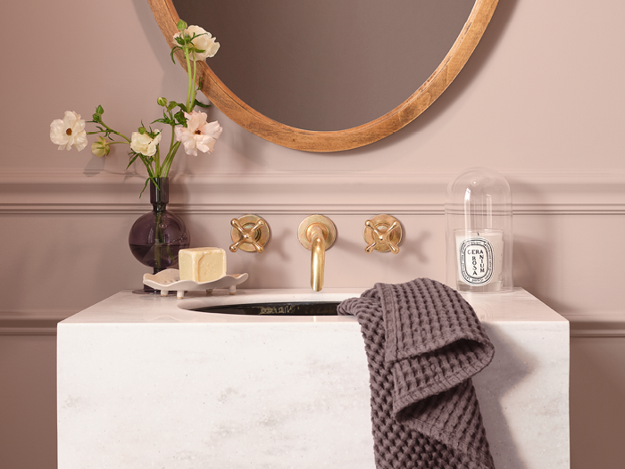
Millennial Pink had a good run, but this dusty rose shade, Glamour, has a much better promise of longevity. As the name suggests, this vintage pink color is great for pairing with elegant details, like marble counters and shiny brass hardware. Paint your walls this color and you may just become the type of person who keeps vases of fresh flowers in every room of the house—including the bathroom.
Morgan Noll, Real Simple