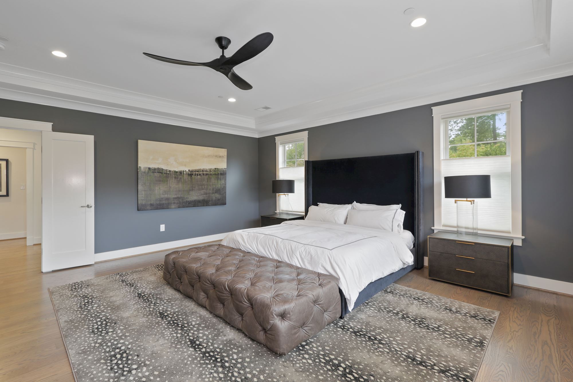
Self-care reigns supreme (again) in 2020, and this priority is popping up in more than just the wellness sector. It’s also being represented in the paint colors chosen for new and renovated homes—especially when it comes to bedrooms. Ahead, experts share a few of the specific hues you can expect to see in bedrooms this year, from the calm, serene paints that connote mindful living to darker, richer shades for the color enthusiast.
Mossy Gray
“Secret Moss,” one of Valspar’s 2020 Colors of the Year, is about as natural as it gets. “It’s an earthy tone that taps into a nature-inspired theme and botanical modernism design direction—perfect for the bedroom!” says Sue Kim, the Color Marketing Manager for Valspar Paint. “Greens have an authentic, comforting quality that allows our mind to relax and unwind, which is necessary for a good night’s rest.”
Pale Yellow
Another one of Valspar’s 2020 Colors of the Year, “Desert Fortress,” is a comforting yellow tone that acts as a blank canvas—it’s up to you to make it your own. “For bedrooms, this light, warm hue is a perfect complement to the cool gray tones we have embraced, creating a balanced cozy environment,” Kim says.
Old-World Blue
An elegant 18th-century blue, like Farrow & Ball’s “Oval Room Blue,” has just enough green to prevent it from feeling too cool, says Patrick O’Donnell, the company’s Brand Ambassador. “It would work well with some classical styling, such large scrubbed oak floorboards, Persian rugs, and a colonial style bed,” he says. “Paint trim in Old White Estate Eggshell to create the patina of age.”
Deep Green
“While having an air of nostalgia, this smart, deep green is the perfect contemporary alternative to charcoal in modern homes and is ideal for creating space in which to curl up at the end of the day,” says O’Donnell of rich, verdant hues, such as Farrow & Ball’s “Duck Green.” He suggests pairing it with light gray woodwork and an ash gray ceiling for a truly timeless feel.
Beige
Beige is making a welcomed comeback. “It’s a really useful mid-tone neutral for those more cautious of committing to too much color,” explains O’Donnell, citing Farrow & Ball’s “Jitney” shade for reference. He recommends says it’s the perfect neutral to add just enough warmth to your space. “This color will work in a country-style bedroom layered with William Morris prints to create something immediately familiar and charmingly nostalgic,” he says. “If your bedroom is on the small side, paint trim in a darker shade, like ‘Deep Reddish Brown,’ to frame the largest surface area. And use a complementary neutral on the ceiling, such as ‘Dimity.'”

