Color is a personal thing—and when it comes to using it in the home, people have strong opinions. “Color can create emotion, drama and depth,” said Sari Mina Ross of Sari Mina Ross Interior Design in Denver. “Choosing colors is like selecting from a candy shop for the senses.”
But there’s a way to do it right. For tips on mixing and matching like a pro, follow these tips from top designers.
Go for Tonal Blends
“Opt for tones that are bold; not loud. Think deep and moody jade green, for example, as opposed to a screaming fuchsia. I tend toward blues because they’re calming and passionate while grounded in nature. I like to stay within three variations of one color. It maintains harmony in a space and gives a sense of depth. In a guest bedroom, for example, I would do a rich blue and go higher in tint and lower in intensity. Add some black for pulls or molding, and white bedding or upholstery for the sofa or rug.”
“While there aren’t any places that are off limits, I prefer smaller spaces for big color to create jewel-box moments. A powder room or a high ceiling are great places to use big, bold color. I don’t love bold color in the entrance—because it slaps you in the face too soon. It’s good to ease into a space and let the color become bolder as you progress through it. And, it doesn’t have to be just paint and textile, you can also get a great dose of color from wallpaper.”
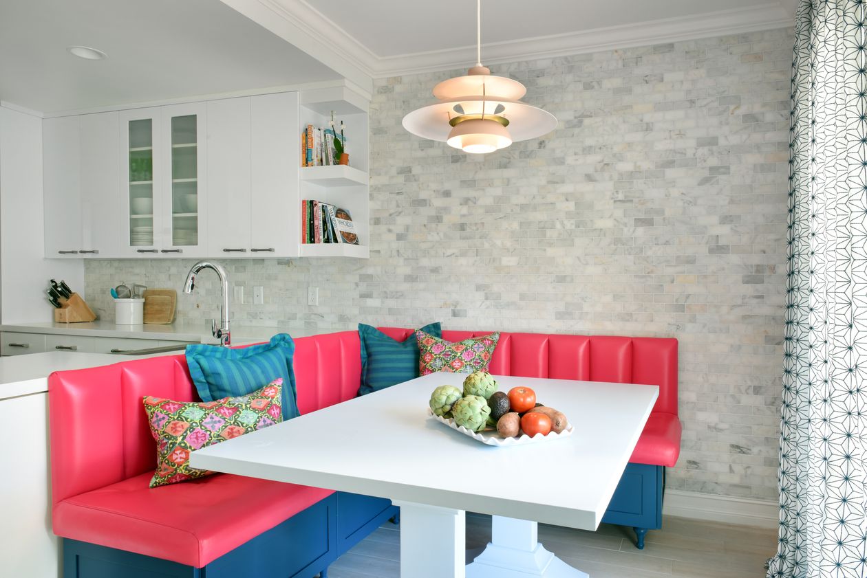
“A great way to mix bold tones is to look to the opposite side of the color wheel. If you have blues in a room, mix in some oranges and reds. It will immediately inject a space with more energy. Keep in mind that these colors can (and should) be used on different textures.” — Sari Mina Ross of Sari Mina Ross Interior Design in Denver
Be Strategic
“If you’re trying to set a specific mood in a room, utilizing bold colors is a great way to make a statement and set the tone. Because of their energizing powers, bold colors are best suited in rooms that are not constantly lived in, but rather, pass-through rooms. Dining rooms, hallways, powder rooms or libraries are all great spaces to infuse with bold color for that reason.”
“Stick to one color family (varying tones of greens or blues, for example) rather than competing colors. This can create a cool monochromatic effect. Typically, I wouldn’t do the entire room in the bold color but opt to use it for accents through furniture or even a ceiling or trim. Use color throughout the various fabrics of the room to tie everything together. Using lighter shades of the same color throughout will also help link everything in a subtler way.” — Christine Markatos Lowe of Christine Markatos Design in Santa Monica, California
Concentrate on the Accents
“I like to use bold colors in accent pieces or art. When you bring in color with pillows, throws or rugs, it gives you the freedom to change the space as you wish. There is more flexibility in non-permanent objects for your space.”
“Work within the framework of analogous or complementary colors. It’s all about experimenting and seeing what works best with your style and space. Start with your accent pieces or art, and then you can go bigger. I really love to change a classic white trim or ceiling to a fun color; it completely changes a space and gives it a wow factor. You can introduce the same hues throughout with rugs, art, chairs, window treatments, et cetera, and pick up additional color with accents in fabric trims and other accessories.” — Nina Grauer of Nina Grauer Interiors in Palm Beach, Florida
Strike a Balance
“If you are afraid to use bold colors, mix those that complement rather than starkly contrast each other. My favorite color combinations are pink and orange and blue and green. I believe, just like in life, in color we need balance. So, if you paint a room that is hot pink, do not put a hot pink mirror on the wall. Maybe put a soft gold or silver mirror. It’s the softer colors that will bring a bold color to life.”
“If done properly, any colors can be mixed. It’s all about the right balance between pattern, texture and material. I always try to add a third neutral color to the palette to center any mix. For example, black and brown animal print centered with a white or ivory.”
“A great way to use a bold color without painting a whole room is to paint the doors and the trim. It brings the perfect amount of color without feeling overwhelming. You don’t want the color to feel random, so use a main color like pink and then layer the room in different shades, such as blush and pale pink.”
— Victoria Bell of Victoria Bell Design in Springfield, New Jersey
Create Congruence
“We have a predominantly neutral palette and then bring in bold colors usually in art and décor to create interest without dominating it. We concentrate on the evolution of one color into another, rather than two colors fighting for attention, and then incorporate those tones throughout so it feels congruent and thought out. Carrying the color throughout a space creates a story and moves your eye through the room. You can create a narrative and dictate how people view the space, bringing them from one focal point to another.” — Marina Hanisch of Marina Hanisch Interiors in New York