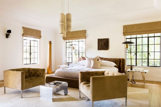
As we close in on a year of living claustrophobically, Americans continue to look for strategies that can quiet the jitters—and don’t involve thousands of calories. One solution: calming decor. To help you out, hundreds of designers were asked what they consider the most soothing interior paint colors.
Nature-inspired palettes of pale blue and olive green were mentioned often. Notably absent? Pigments such as fire-engine red and neon green, which the experts view as invigorating at best and anxiety-inducing at worst. “As a rule of thumb, the more saturated and pigmented the color, the more it is associated with excitement and stimulation,” explained Palo Alto, Calif., architect Mary Maydan.
Here are the four specific paint colors that were most frequently cited by an expert panel, followed by four hues that designers generally agreed jangle the nerves.
THE MOST-PACIFYING PIGMENTS
Borrowed Light No. 235
Farrow & Ball
Shades that call to mind sea and sky work on us like an aesthetic chill pill. “These colors connect us to the natural world, which does wonders for our stress levels,” said New York designer Ariel Okin, who singled out Borrowed Light. Chicago designer Kelly Hurliman said of the hue, “It feels as though it has been magically mixed with sunlight.” From $110 a gallon, farrow-ball.com
Alabaster OC-129
Benjamin Moore
“Relaxing at the spa.” So Brooklyn designer Shelby Girard described the mood this white evokes, especially when paired with natural materials like rattan and jute, she said. The hue never reads yellow or pink, said New York designer Nate Berkus. “Alabaster is a chalky, warm, almost plaster-like white,” he said. “I like an environment that is a study in neutrals, which I’ve always found soothing and peaceful.” $80 a gallon, benjaminmoore.com
Graceland
Portola Paints & Glazes
Bringing natural tones indoors “plays to our most primal inner senses,” said Barrington, Ill., designer Katie Wozniak of shades on the green spectrum. Portola’s Graceland is a pleasantly muddy and muted green that Los Angeles designer Erick Garcia calls “earthy.” He would use it in a bedroom, living room or master bedroom. “It has a sense of peace and optimism.” From $64 a gallon, portolapaints.com
Shark
PPG Paints
Philadelphia designer Joe Berkowitz compares Shark to a cloudy day that mellows the psyche. The light gray shade with brown undertones is “easy on the eyes.” Kara Mann used Shark in a client’s bedroom. “It works with both warm and cool tones,” said the Chicago designer, “but what makes it soothing is the way it subtly changes throughout the day’s light.” From $36 a gallon, ppgpaints.com
THE MOST-DISCONCERTING COLORS
Orange
While pretty poolside, the bright and bold citrus-y hues we embrace on tropical vacations translate poorly into paint colors at home, said New York designer Mikel Welch. “Orange tones on entire walls typically have a florescent quality that ‘burns’ the eye, so to speak,” he said. “The effect is similar to staring at the sun.” Jean Stoffer, a designer in Grand Rapids, Mich., refers to these tones as “huge punctuation marks of color.” Punctuation should not be huge.
Red
Why do we often see bright red décor in fast-dining establishments, à la McDonald’s ? Because the business model relies upon our not wanting to hang around, explained Los Angeles designer Kevin Isbell. “Red packs a fiery punch that makes it difficult to relax,” he said. New York designer Rayman Boozer finds bright red hues vibrant and exciting but also challenging to incorporate into a soothing design. “It is a great color for lipstick but not my pick for relaxing home décor,” he said.
Hot Pink
Color-loving San Francisco designer Homan Rajai describes pigments such as fuchsia as “aggressive, graphic and blunt.” Primary and non-complex colors, like those in a 12-pack of Crayola markers, will always read as least-soothing, confirmed Atlanta designer Lauren Lowe. Said Ms. Maydan, “Being surrounded by colors like this for too long can actually heighten stress and anxiety.”
Vivid Yellow
In a space meant to soothe, aggressive yellows will accomplish the opposite. “For me, a bright yellow is very stimulating,” said Chicago interior designer Alexandra Kaehler. “It’s exciting in a powder room or closet that you don’t necessarily visit for a respite. It just doesn’t offer that calming effect.” And steer totally clear of yellows of an acidic or highlighter-like nature, which Los Angeles designer Greg Roth describes as having an “energy and buzz to them that works great for motivating the troops or getting you up and dancing but, for getting ready for bed, maybe not so much.”
